Analysis of the genomic response of human prostate cancer cells to histone deacetylase inhibitors (Supplementary data)
Original manuscript
Supplementary Methods
In the following “Supplementary Methods” section we extensively describe all methods and data sources used in our study. In particular we provide details about the source of gene expression datasets, the platforms and annotation packages employed, the pre-processing procedures adopted for each dataset, the statistical details of the analysis performed, and the gene set databases used for the Analysis of Functional Annotation (AFA).
The “Supplementary Methods” section can be downloaded here:
Supplementary Figures
Gene membership for the differentially expressed Functional Gene Set (FGS) associated with HDACI-treatment.
Heatmaps visualizing gene membership to FGS enriched in DU-145 and PC3 cells upon HDACI treatment. Rows in the heatmaps correspond to described in Figure 1 of the main paper, while columns represent the most differentially expressed genes (FDR < 0.1%) annotated to such FGS. In the heatmaps gene membership to specific FGS is highlighted in white, while black is used when genes do not belong to the FGS. Hierarchical clustering of rows and columns was obtained using the binary distance and the Ward clustering method.
- Supplementary Figure S1: FGS membership for differentially expressed genes
- Supplementary Figure S2: FGS membership for up-regulated genes
- Supplementary Figure S3: FGS membership for down-regulated genes
Social network analysis of enriched FGS upon HDACI-treatment.
Weighted undirected networks based on differentially regulated genes in common among the enriched FGS from Figure 1 of the main paper (see also Supplementary Figures S11, S12 and S13 above). In these networks vertexes represent specific FGS, while edges (and their weights) are based on the number of differentially expressed genes in common among the FGS. Social network analysis was used to identify distinct FGS ”communities” (i.e. subgraphs of FGS sharing common subsets of genes), and are shown in the figures with distinct colors.
- Supplementary Figure S4: Differentially expressed FGS communities
- Supplementary Figure S5: Up-regulated FGS communities
- Supplementary Figure S6: Down-regulated FGS communities
Heatmaps showing samples gene expression correlation upon HDACI treatment versus control.
The color code used for the columns highlights the different inhibitors that were used: VPA in yellow, SAHA in red, Buphenyl in blue, TSA in green, CG1521 in purple, and miR transfection in cyan. The color code used for the rows highlights the different cell lines that were analyzed: DU-145 in red, PC3 in blue, and LNCaP in green. Correlations were computed between t-statistics and log2 fold-change (Supplementary Figures 1 and 2 respectively), and they express the degree of differential gene expression between treatment and control.
Correspondence At the Top (CAT) curves for differential gene expression in HDACi-treatment.
Correspondence At the Top (CAT) curves for differential gene expression in HDACi-treatment. Genes were ranked in decreasing (or increasing) order by t-statistics (or log2 fold-change) expressing differential gene expression between treated and untreated cells. Each CAT curve represents the proportion of differentially expressed genes that are in common between comparisons from distinct studies. In particular results for DU-145 or PC3 cells from GSE34452 are compared to results from other studies (GSE8645, GSE31620, and Connectivity Map). CAT curves in the white area above the gray shading indicate agreement, while CAT curves below it indicate disagreement between experiments. The grey shading represents the 99% probability intervals of agreement by chance.
- Supplementary Figure S9: DU-145 cells, decreasing t-statistics
- Supplementary Figure S10: DU-145 cells, increasing t-statistics;
- Supplementary Figure S11: PC3 cells, decreasing t-statistics
- Supplementary Figure S12: PC3 cells, increasing t-statistics
- Supplementary Figure S13: DU-145 cells, decreasing t-statistics
- Supplementary Figure S14: DU-145 cells, increasing log2 fold-change
- Supplementary Figure S15: PC3 cells, decreasing log2 fold-change
- Supplementary Figure S16: PC3 cells, increasing log2 fold-change
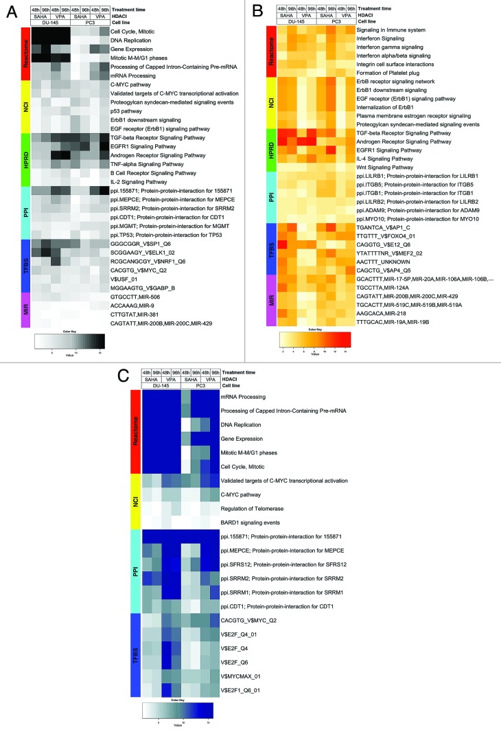
Heatmaps showing enriched FGS after HDACI-treatment across studies.
Heatmap visualizing FGS enriched in DU-145 and PC3 cells upon HDACI treatment (GSE34452), along with the level of enrichment for similar experiments in other studies (GSE8645, GSE31620, and Connectivity Map). These heatmaps correspond to Figures 1A, 1B, and 1C in the main paper. Each row represents a distinct FGS, while each column represents a distinct comparison from our linear model analysis. Color scales representing the enrichment correspond to absolute log10 adjusted p-values (i.e. the number on the color scale increases with decreasing adjusted p-values). Enriched FGS were selected from different collections in order to encompass distinct and complementary biological concepts, as shown by the color bar on the left of each heatmap. Cell signaling FGS are highlighted in red and yellow (Pathway Commons Reactome and NCI pathways, respectively), signaling pathway target gene sets in green (Human Protein Reference Database, HPRD), protein-protein-interaction networks in cyan (PPI, as compiled in the NCBI Entrez Gene database), FGS for shared transcriptional factor binding sites (TFBS) in blue, and microRNA (MIR) targets gene sets in pink (both from the Broad Institute Molecular Signature Database collections).
- Supplementary Figure S17: Differentially expressed FGS across studies
- Supplementary Figure S18: Up-regulated FGS across studies
- Supplementary Figure S19: Down-regulated FGS across studies
Flow cytometry graphs after treatment of PC3 or DU-145 cells.
Treatments included combinations of Colcemid with HDACIs, or HDACIs alone, across several time points. PC3 cells were treated for variable periods with either 9 μM SAHA alone, or a combination of 0.1 μg/ml Colcemid with 4 μM SAHA or 4 mM VPA. DU-145 cells were treated for variable periods with either 9 μM SAHA alone or a combination of 0.04 μg/ml Colcemid with 4 μM SAHA or 4 mM VPA. Every 2-3 hours cells were harvested and stained with propidium iodide and flow cytometry analyses were performed. Combining HDAC-inhibitors with Colcemid resulted in mitotic accumulation of PC3 cells.
Differential gene expression analysis
Nore that columns in the HTML files can be sorted by clicking the column header.
- Differentially expressed genes upon HDACIs treatment in DU-145 and PC3 cells:
- Differentially expressed genes upon HDACIs treatment in LNCaP cells: GSE8645 dataset
- Differentially expressed miRs upon HDACIs treatment in LNCaP cells: GSE31620 dataset
- Differentially expressed mRNAs upon HDACIs treatment in LNCaP cells: GSE31620 dataset
- Differentially expressed genes upon HDACIs treatment in PC3 cells: Connectivity Map dataset
Gene annotation table headers
- ProbeName: Microarray Feature Identifier
- logFC:* Logarithmic transformation (base 2 of the fold-change between groups
- AveExpr: Logarithmic transformation (base 2) of the average expression for the group
- t: Moderated t-statistics
- P.value: Unadjusted P value
- adj.P.Val: Adjusted P value with the Benjamini-Hochberg method
- B: B-statistics, log odds
- ENTREZID: Entrez Gene Identifier, linked to the NCBI ENTREZ Gene database
- SYMBOL: Gene Symbol
- GENENAME: Official Gene Name
- UNIGENE: Unigene Cluster Identifier, linked to the NCBI Unigene database
- ENSEMBL: ENSEMBL Gene Identifier, linked to the ENSEMBL database
- OMIM: Online Mendelian Inheritance in Man
Analysis os Functional Annotation (AFA), Top 200 FGS, FDR < 5%
Columns in the HTML files can be sorted by clicking the column header.
- Browse HTML tables for:
- Browse HTML tables for GSE8645 dataset
- Browse HTML tables for GSE31620 dataset
- Browse HTML tables for Connectivity Map dataset
Functional Gene Set (FGS) tables headers
- Gene Set Name: The unique Functional Gene Set identifier
- GeneSetDescription: The hyperlink to the list of the FGS differentially expressed genes
- Value: The raw p-value obtained from the Wilcoxon log-rank test
- Gene Set Size: The number of gene contained in the FGS for the microarray platform under analysis
- Corrected Value: The adjusted p-value obtained using the Benjamini-Hocberg method
- Ranking: The FGS ranking
- Description: The extended description of the FGS
- URL: The hyperlink to the webpage containing further information about the FGS
Heatmaps for the Analysis of Functional Annotation
- FGS enriched in GSE34452 (FDR < 5% in all comparisons) by differential gene expression
- FGS enriched in GSE34452 (FDR < 5% in all comparisons) by gene up-regulation
- FGS enriched in GSE34452 (FDR < 5% in all comparisons) by gene down-regulation
- FGS enriched in ALL studies (FDR < 5% in at least one comparison) by differential gene expression
- FGS enriched in ALL studies (FDR < 5% in at least one comparison) by gene up-regulation
- FGS enriched in ALL studies (FDR < 5% in at least one comparison) by gene down-regulation
Figure Legends: In all heatmaps the color scale represents the negative base 10 logarithm of the q-values obtained after adjusting the Wilcoxon rank-sum test P-values using with the Benjamini-Hochberg method. Functional Gene Sets are represented on the rows and were clustered using the Euclidian distance and the average clustering method, while the comparisons for the different HDACIs treatments were represented by column and were not reordered.